Important Info – The Reason Your Site Should Be Mobile Responsive
Posted Tuesday, March 18th, 2014 - 1,214 views
 Having a responsive website tops the list of most important factors necessary to having a successful online business; there is no question about this whatsoever.
As of March 2014, from 30% to 70% can be attributed to be mobile users visiting a website and statistics prove, that when a mobile user visits your website and you haven’t taken their user experience into consideration, chances are they’ll hit the back button and try another site again.
Today, one way of standing out against your competitors and making your site a sticky one for those on smaller devices, is to give them a mobile version of your website; a website that’s responsive.
How does a responsive website work?
When a user views your website on a regular desktop computer, they see it the way you meant it to be presented. Most times they can view and use it the way you intended them to but when it comes to viewing your website on a mobile device, that’s usually a whole different story.
Take a look at a perfect example of what I’m talking about below. You’ll see how Google presents their website to a desktop user (the design we’re typically used to by Google) and how they present their search engine to someone on a mobile phone:
Desktop vs Mobile Google Search Results
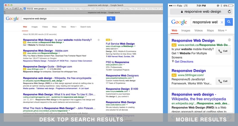
Clearly, there’s two distinct layouts that Google presents to users who are viewing their website on mobile phones. If Google is doing taking their mobile users into consideration, it’s safe to say that business website owners should be doing the same.
Search engines know first hand that if users don’t find what they’re looking for on their search engine, they’re probably going to try another one. They know that if they don’t facilitate a meaningful experience for users on mobile devices they might lose them.
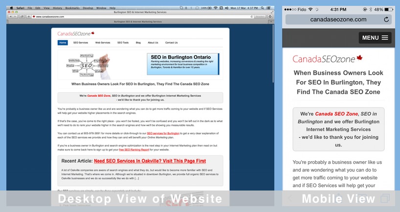
Check out the differing views of our website on a desktop vs viewing our site on a mobile phone
Do you want your competitors taking business away from you? Most likely not. Even if they take away 1 customer a month by retaining them through a mobile search, depending on your business, that could be a lot of money. Making your website responsive is a wise investment, period.
Try visiting your website through your mobile phone
Visit your website from your mobile phone or iPad, browse around (especially in a way you would hope your users would use your website), and judge for yourself. If the responsiveness of your website hasn’t been addressed, you’ll be able to tell right away, and if it has, you can pat yourself on the back. Job well done.
Then there’s the SEO factor when it comes to responsive websites
Let me make a long story short, and I hope you believe me; when it comes to SEO and general search engine placements, all the search engines place a special interest on responsive sites. If you re-read the first half of this article carefully, you’ll understand why, but in case it’s not quite clear yet, let me explain the reasoning why the search engines also want your sites to get responsive.
Think “user experience“. Now tell me what you may do if you’re on your device, and every website you click on in the BING search results gave you a website that you can’t even use or frustrates you to no end? You’ll probably try another search engine and they know this. So when you help their users by ensuring your site responds to the type of user that’s viewing it, and displays the content accordingly, that sends a slew of positive signals to the search engines, of which they’ll use to their advantage.
Also, the value of SEO can be partially enhanced through measured engagement. That means, if a mobile user is positively responding to your website, those engagement indicators are picked up by Google and tells them that your website is usable, user friendly and thus worth listing in the search results. It’s a win win situation for everyone.
Mobile statistics in general and related to SEO
When it comes to mobile statistics, you’ll have no problem finding a slew of websites that will display to you the necessity of making your website responsive. As recently as last week (March 11 – 13, 2014) Matt Cutts of Google stated he wouldn’t be surprised if mobile searches surpassed search engines searches that are done on desktop computers.
Morgan Stanley analysts believe that, based on the current rate of change and adoption to mobile platforms, by 2015 the majority of web activity will be handled by mobile devices.
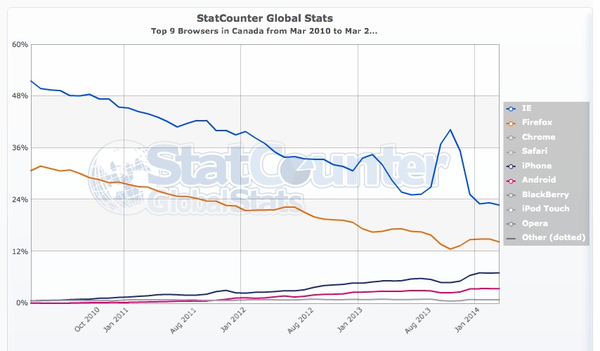
According to StatCounter, in Canada alone, mobile usage has slowly rose from just under 1% to almost 10% from March 2011 to today – March 2014. At first glance that may not seem like a substantial increase, but two important factors point to how important this increase really is; one is, that mobile usage is definitely on the increase and the other statistics indicate this trend will only continue. The second important factor to consider is whether you as a business owner are willing to give 10% of your business to your competitors.
If your business is in a big city like Toronto for instance, responsive mobile design is pertinent to capturing as many mobile visits as possible. The same goes with smaller cities like Burlington. Although there are less searches for your services, being responsive will ensure that you at least retain your visitors rather than push them away.
In June of 2013, Google published a blog post addressing mobile websites and indicated:
To improve the search experience for smartphone users and address their pain points, we plan to roll out several ranking changes in the near future that address sites that are misconfigured for smartphone users.
Simply put; if you’ve implemented a mobile responsive environment for your users, chances are you’ll rank higher in the search results when users search for your products or services. You can’t go wrong.
More mobile statistic
Take note that usage of Internet Explorer and Firefox have substantially decreased. Although this isn’t 100% because of the increase of the usage of mobile devices, the use thereof has definitely created an impact.
Here are some stats that should really compel you to stay ahead of the game and get responsive:
- 74% of mobile users will wait 5 seconds for a web page to load on their mobile device before abandoning the site
- 46% of mobile users are less likely to return to a website if it didn’t work properly during their previous visit
- 71% of mobile users expect web pages to load as quickly or faster as web pages on their desktops
These statistics and bits of information alone point to the importance going mobile and giving your visitors a pleasant user experience.
Should I make a separate mobile version of my website and show that to mobile users?
The short answer is no. Without going into too much detail, take the time (and it’s actually not much extra time) to migrate your code to be responsive. This way, once the migration is over, you’ll only have one place to edit and update files and information. It’s much easier changing the price or special on one page than having to jump into your “mobile files” and doing it again – more efficient.
From an SEO perspective either implementation will suffice, but you can see the benefit in migrating your current site based how speedy and easily your updates will be.
The take home
If it seems like going mobile will be a huge and daunting task, I’d like you to rest assured, that for the most part migrating your website’s code to be responsive isn’t nearly as complicated as the initial development of your website. If you hire the right developer, once they start the project, he or she should be able to migrate your code to be responsive within a few days. This number does depend on some varying factors but for the most part it doesn’t take too long.
However please note, when it comes to going mobile, your developer needs to be aware of “user experience” and needs to ensure that the most important elements are displayed on your pages without too much distracting clutter. Information that distracts your users, confuses them, makes them wait more than a few seconds to load or simple fluff, isn’t going to cut it. You’re going to have to use trial and error to determine which aspects of your website will facilitate your goals.
In closing, you and/or your developer will have to know, or do their research in order to create the most effective mobile environment for your particular kind of user. I’ll post more information on displaying elements to mobile users in a future post. Stay tuned.
The era of mobile phones is enough reason, isn’t it? Every man now is using Andoid mobile, tablet, and etc. more than desktop or laptop.